How to... Make Waiting Areas More Accessible
Create a welcoming space.
Welcome to the special edition for paid subscribers!
Paid subscribers receive an exclusive email every two weeks with ideas and tips on making the world more accessible, in addition to the main newsletter.
Today's newsletter is about waiting areas.
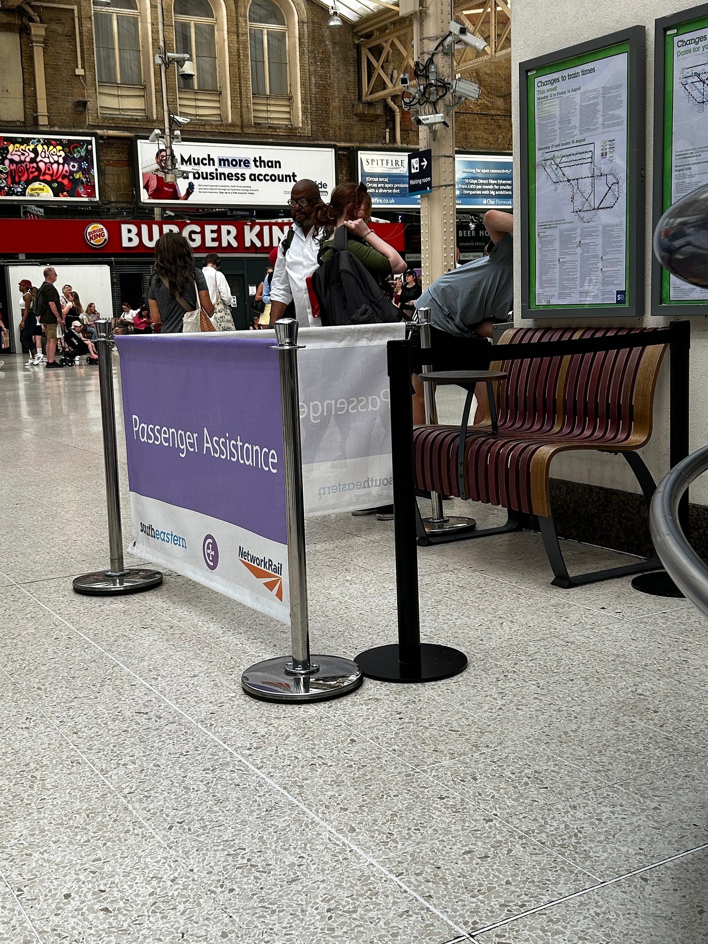
Designing accessible waiting areas in airports and stations is crucial for ensuring comfort and a welcoming experience. I’m not the biggest fan of most assisted travel waiting areas (these are the waiting areas only for disabled people). Some are very segregated and not even very accessible. These areas often send a message: “We couldn’t care less how you feel here, but it’s convenient for us to know where our disabled passengers are.”
So if you plan to modernise any waiting areas and care about how your passengers feel, these are some points to consider:
Space and Layout: Ensure enough space for manoeuvrability, allowing wheelchair users and those with mobility aids to navigate easily. Seating should include spaces for wheelchairs next to standard seats, enabling users to sit with companions. If possible, give passengers access to chargers.
Shopping and restaurants: At some airports, disabled people get the feeling that they are not allowed to leave the designated waiting area. That ruins the airport experience quite often. Avoid that. Alternatively, give them buzzers and page them back when the assistance agent is ready to bring them to the gate. So they can go shopping without the fear of missing their assistance.
Keep reading with a 7-day free trial
Subscribe to The Accessible Link to keep reading this post and get 7 days of free access to the full post archives.


